Results
Contents
Results#
The model results demonstrate that there is a significant impact on yield and all other parameters from varying irrigation depths and times. This section focuses on presenting the effects on the Yield (tonnes/ha) output of the Aquacrop model, but a number of results pertaining to crop growth and water efficiency and storage are mentioned and the results are plotted and available in the annex. In the subsequent discussion “yield” refers to the Aquacrop output Yield (tonnes/hectare), unless otherwise specified. Days are given in days since planting, with the initial planting date constant at December 15th.
Aggregation across growing season#
There is a large variation across growing seasons regardless of the irrigation depths and schedules as the following charts show. The dramatic drops in production seen in the actual yields of wheat (including both Triticum aestivus and Triticum durum) plotted in the introduction correspond to the model quite well.
Across seasons, we see that biomass, yield and transpiration are strongly positively correlated. Surface evaporation has a strong negative correlation with yield and biomass, clearly increasing during drought years and decreasing during bumper years.
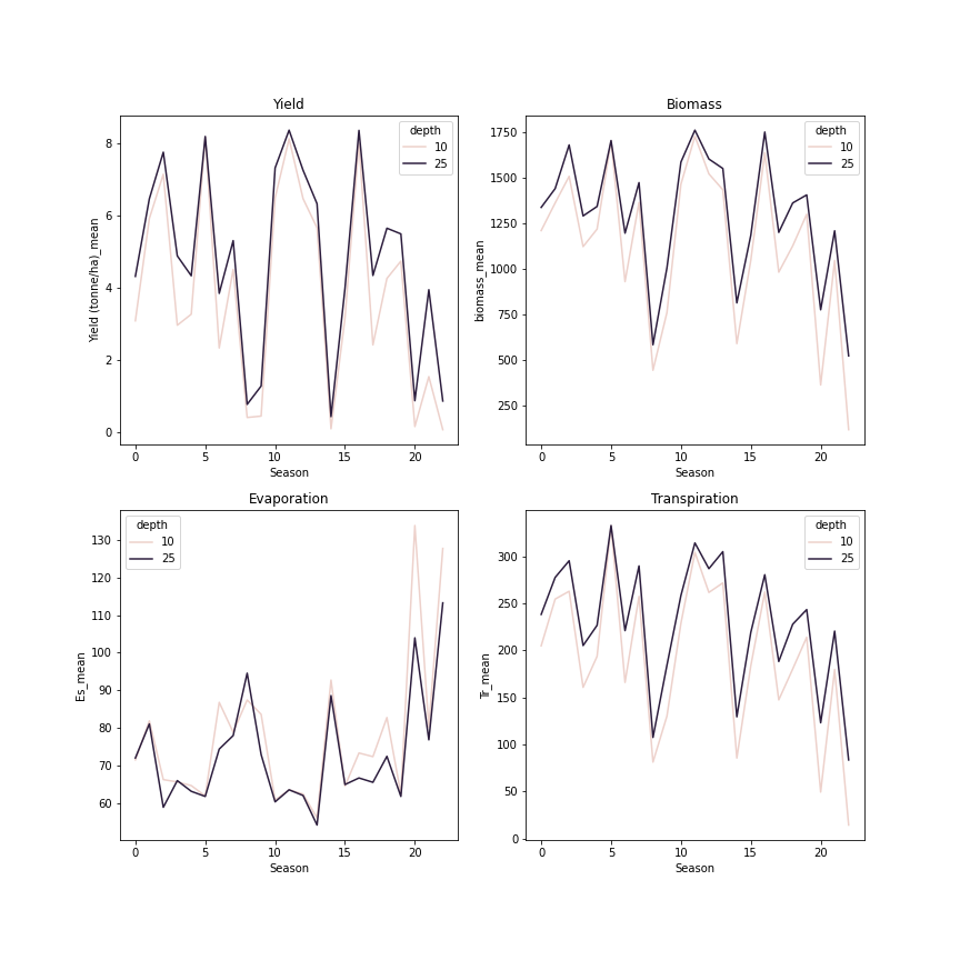
Fig. 2 Aggregation by growing season of 250 runs of 10 mm and 25 mm irrigation depths with irrigation dates chosen randomly from the intervals [15 Jan,15 Mar] and [16 Mar,15 May]#
The mean yield converges for all 8 tested intervals and all 5 depths during seasons with bumper crops. During seasons with severe drought causing drops in yield, increased irrigation clearly improves the yield and there are small differences visible among the different irrigation intervals.
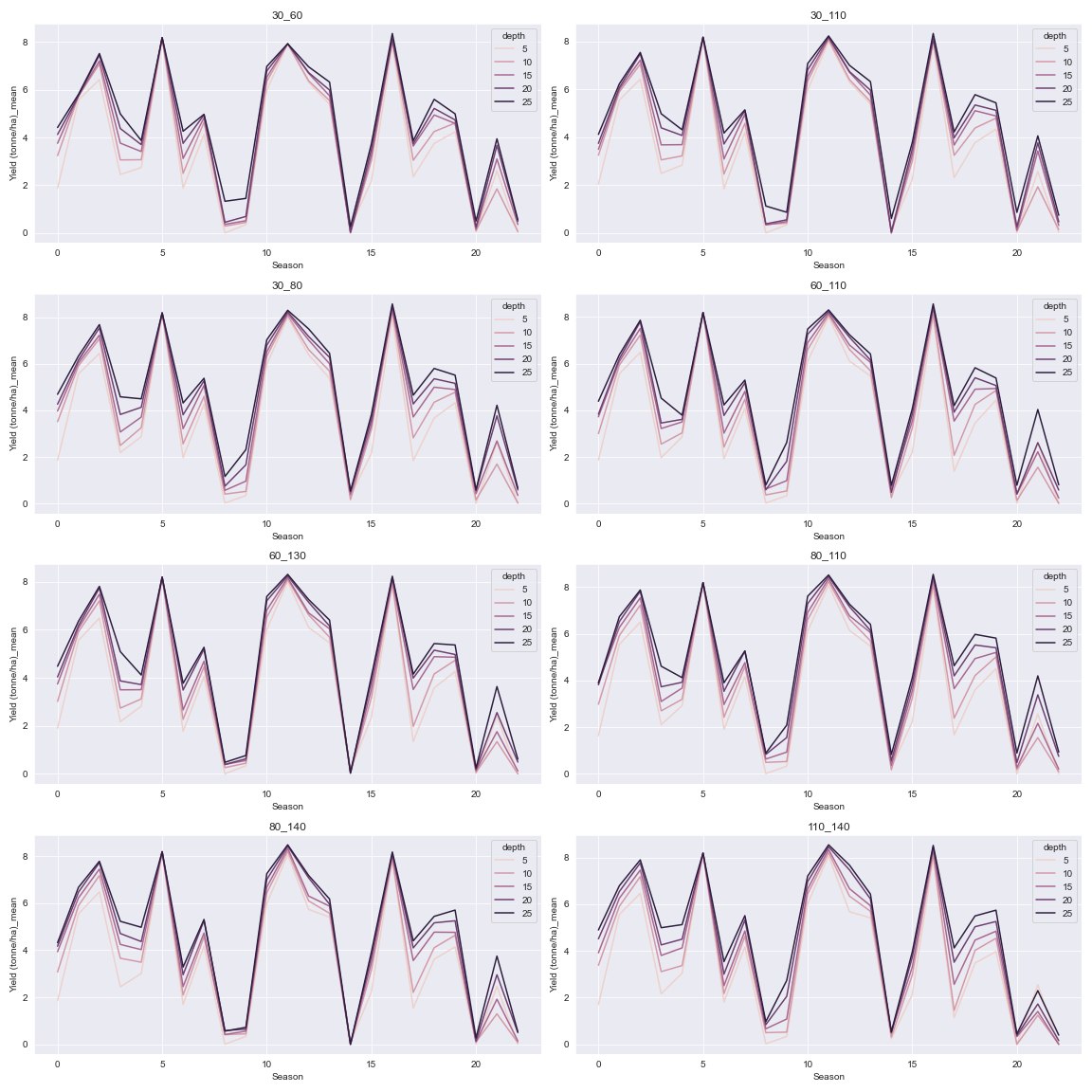
Fig. 3 The 8 different irrigation intervals aggregated by season and stratified by irrigation depth.#
Yield#
The below regression plots of yield versus the first and second irrigation day using the baseline set of runs demonstrate that at every irrigation schedule, 25mm of irrigation provides a significantly higher yield than 10 mm. As can be seen from the chart, even the worst performing irrigation dates at 25 mm depth have much higher yields than irrigation times at 10 mm depths. Given the constraints imposed by the randomization method chosen, the following conclusions about the irrigation dates can be taken from visually inspecting the data:
There are local optimums around day 35 and day 90 for irrigation 1
There is a local optimum around day 105 for irrigation 2
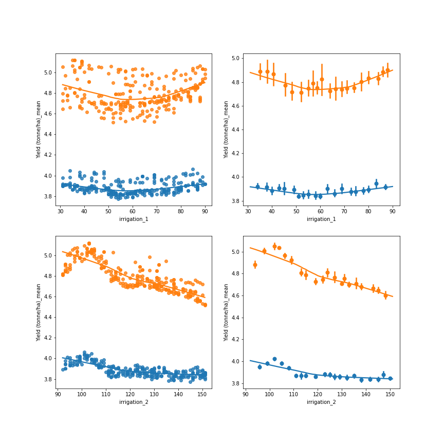
Fig. 4 Regression plot of 250 runs of 10 mm and 25 mm irrigation depths irrigation dates chosen randomly from the intervals [15 Jan, 15 Mar] and [16 Mar, 15 May]. Top represent Yield against the first irrigation date, Bottom row represents yield versus the second irrigation date. Orange is 25 mm irrigation, blue is 10 mm irrigation. Left columns are scatter charts of actual values, right columns values are grouped into 20 bins with the mean represented by the dot and the standard deviation represented by the vertical line for each bin.#
Looking at the mean yield in the below figure, we see that increasing the irrigation amount improves mean yield by a relatively constant amount. Further, this effect is more important than the effect of choosing among the 8 irrigation intervals chosen for testing. Nonetheless, the following intervals stand out: 1) day 30/day 110, 2) day 80/day110, and 3) day 110/day 140. The commonality is the irrigation date around the interval centered around day 110.
There is an inverse relationship between variance and depth, which comes from the irrigation dates being able to mitigate somewhat the effects of drought on the mean yield. The maximum yield varies less with both irrigation schedule and irrigation depth (notice the scales are not the same for each chart!) than the mean yield. This suggests that the maximum is more determined by favorable climatic conditions than than the mean yield, and conversely that irrigation management has a stronger effect on the mean than on the maximum under these conditions.
Finally, the minimum value corresponds to the growing season with the worst drought for each run. Like the maximum, the minimum value varies less than the mean, which again implies that the seasonal variation in climatic conditions drives the minimum seasonal yield in each run.
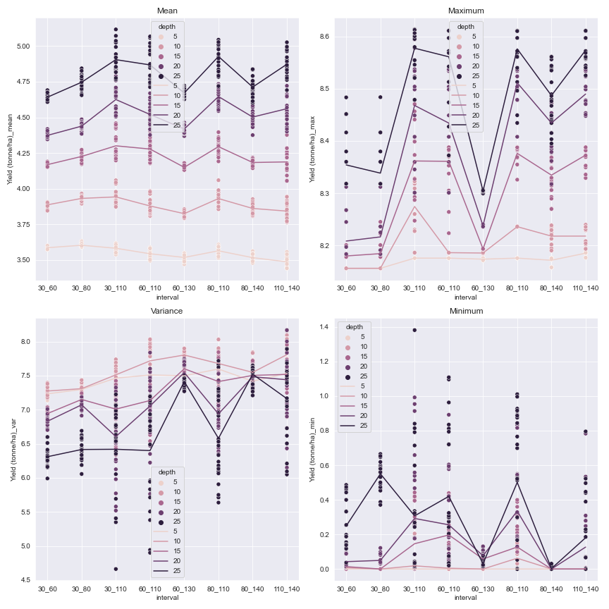
Fig. 5 Statistics representing the yield for each tested interval. The dots representing the actual values for each random date pair are stacked by their corresponding interval and colored according to the irrigation depth. The colored lines represents the mean value of each (irrigation depth, irrigation interval).#
The tables below of the top 15 yield mean yields for the interval runs and the baseline run shows the strong correspondence between the two strategies in identifying an optimum.
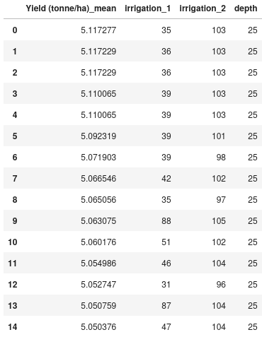
Fig. 6 Top 15 irrigation date combinations by mean yield for the random baseline#
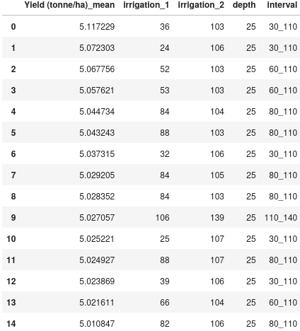
Fig. 7 Top 15 irrigation date combinations by mean yield across all intervals.#
Significance testing#
Finally, a two-sided Welch’s t-test, a variant of the student t-test more robust to Type 1 errors appropriate for comparing means of samples with different sizes and variances, was used to determine if there is a significant difference between the means of each interval and the means of the baseline runs. Since the baseline was only run using 10mm and 25mm depths, only these depths were used in testing the intervals. Welch’s variant is given below:
for \(\bar{X_i}\) is the sample mean of each group i and \(s_\bar{X_i}\) is the standard deviation of each group i. The degrees of freedom is approximated by the following formula, the Welch–Satterthwaite equation:
The results show that in general the results are significant at both 10mm and 25mm intervals, with only 2 of the 10mm intervals not meeting the criteria.
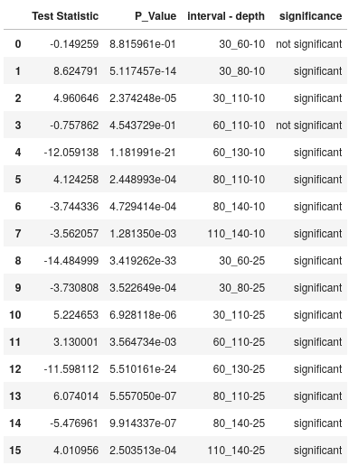
Fig. 8 Significance table for the tested intervals compared to the baseline.#